
 |
|
|
||||||
 |
|
|

|
|||||
 |
||
|
|
|
|
|
|
|
||
|
|
|
|
|
| Advertisement | ||||||||||||||||||||||||||||||||||||||
|
What are they saying about new emblem ( 2003-08-04 09:59) (China Daily)
Jacques Rogge, IOC president:
Your new emblem immediately conveys the awesome beauty and power of China that is embodied in your heritage and your people. It clearly said that Beijing would put its focus on the performer, on the athletes and artists and volunteers who join this great journey to the Games. As this new emblem becomes known around the world and as it takes its place at the centre of your Games, we are confident that it will achieve the stature of one of the best and most meaningful symbols in Olympic history. Hein Verbruggen, chairman of the IOC Co-ordination Commission for the 2008 Beijing Olympic Games:
We (the IOC) are extremely pleased with the logo. When we firstly confront with the logo, I could describe it very Chinese. It was striking that we, who do not have the pleasure to be Chinese, found it extremely attractive. This logo will certainly fulfill the ambition that you can have (to host the best ever Olympics). Brad Copeland, IOC adviser on the look of the Games, design director of the 1996 Atlanta Olympics and one of the four international judges of the new identity of the 2008 Beijing Olympic Games:
The new emblem is one of those things that is so simple and that is so obvious. It works small and also big, internationally and also nationally. It's simple in the way that it conveys a very simple and important concept. It allows it to work flawlessly in every conceivable application that an Olympic identity must work in. It tells a story - of a country that is making a promise to the world, that has embarked on an important journey, that is in the midst of an incredible transformation. Scott Givens, managing director of the Creative Group of the
2002 Salt Lake City Winter Olympic Games and one of the international
judges: I was drawn to the spirit and vitality represented by the logo image. The logo with its outstretched arms spoke of the essence of the Chinese people, their friendliness ... their happy smiles ... and their warm welcome. It also said something about the Olympics with its power to welcome and unite the peoples of the world. Add to this, the fact that the logo character had roots in traditional Chinese calligraphy and fundamentally represented the symbol for Beijing, and to me it was the winner all around. Zhang Yimou, China's international-acclaimed director: It has a strong flavour of traditional Chinese culture and you can feel that it belongs to China at the first glance. Tao Luna, famous markswoman who won the first gold medal for China at the 2000 Sydney Olympic Games: I like its shape because it looks like an athlete with his or her arms open. And the legs show he or she is doing something athletic. It surprised me because it looks so unique and totally different than I had expected. Yan Ran, an 18-year-old Beijing middle school student: It is deeply moving. It is very simple but captures the essence of Chinese culture. It is so Chinese that it makes me think of Peking Opera.
|
|
 |
||||||||||||||||||||||||||||||||||||
| .contact us |.about us | ||||||||||||||||||||||||||||||||||||||
|
|
|
|
|
|
|
|
| Copyright By chinadaily.com.cn. All rights reserved |
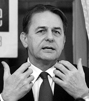 Within a few short years, the emblem we unveil here tonight
will become one of the most visible and recognized marks in the world.
Within a few short years, the emblem we unveil here tonight
will become one of the most visible and recognized marks in the world.
 Of course, we have some problems understanding the
characters (on the logo) but, even for somebody who isn't able to read Chinese,
visually it is very strong.
Of course, we have some problems understanding the
characters (on the logo) but, even for somebody who isn't able to read Chinese,
visually it is very strong.
 Out of 10 points, I would give it a 10. It will stand
against any Olympic identity that will ever be created.
Out of 10 points, I would give it a 10. It will stand
against any Olympic identity that will ever be created.

